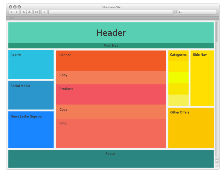
Website Layouts: Understanding Types and Exploring the Most Popular Layouts

Website layout refers to the arrangement of various elements on a web page. These elements include text, images, navigation menus, forms, and interactive components. A well-designed layout should strike a balance between aesthetics and functionality, creating a visually appealing design while maintaining a smooth and intuitive user experience. [c]Types of Website Layouts[/c] 1. Fixed Layout: In a fixed layout, the width of the website remains constant regardless of the user's screen size or device. The design is typically set to a specific pixel width, which means it may not adjust well to different screen resolutions or devices with varying dimensions. While fixed layouts offer precise control over design elements, they can lead to horizontal scrolling or poor user experiences on smaller screens. 2. Fluid Layout: A fluid layout, also known as a liquid layout, adapts and stretches based on the user's screen size or device. Elements are specified using relative units (e.g., percentages), allowing the website to adjust its width and proportions dynamically. Fluid layouts provide a more flexible and responsive experience, making them suitable for a wide range of screen sizes, including desktops, tablets, and smartphones. 3. Responsive Layout: A responsive layout takes the idea of a fluid layout further by actively responding to the user's screen size and orientation. It uses CSS media queries to apply different styles and adjust the layout based on specific breakpoints, ensuring an optimal viewing experience across various devices. Responsive layouts eliminate the need for separate mobile versions of websites, streamlining maintenance and providing a consistent user experience. 4. Grid-based Layout: Grid-based layouts use a grid system to arrange content and maintain visual consistency throughout the website. Web designers divide the page into columns and rows, aligning elements within the grid to create a structured and organized design. Grid layouts offer versatility and are widely used in both fixed and responsive designs. [c]Most Popular Website Layout: Responsive Design[/c] Responsive design has become the most popular website layout approach due to the increasing diversity of devices used to access the internet. Whether users are on a large desktop monitor, a laptop, tablet, or smartphone, a responsive layout ensures that the website adapts seamlessly to different screen sizes and resolutions. [c]Key Benefits of Responsive Design:[/c] 1. Mobile-friendly: The layout automatically adjusts to provide a smooth user experience on various devices, reducing the need for horizontal scrolling or zooming. 2. SEO-Friendly: Search engines favor responsive websites, as they offer a consistent URL and HTML across all devices, leading to better search rankings. 3. Cost-Effective: A single responsive website eliminates the need to maintain multiple versions for different devices, reducing development and maintenance costs. 4. User Experience: Responsive design creates a user-friendly experience, contributing to higher engagement, lower bounce rates, and increased conversions. Website layouts play a pivotal role in shaping user experiences and determining the success of a website. Understanding different types of layouts, such as fixed, fluid, and responsive, empowers web designers to create visually appealing and functional websites that cater to a diverse audience across various devices. Among these layout types, responsive design stands out as the most popular and effective solution, providing a seamless user experience and supporting the ever-changing landscape of web browsing.